Tile Editor
HousePanel customization can be done using the Tile Editor and the Tile Customizer. The Tile Editor changes how tiles and pages look, including background images, icons, colors, fonts, and alignment. The Tile Customizer changes the content of each tile. The Tile Customizer has features to add user provided text or content from other tiles to the tile being customized. Tile Customizer is also where users can define powerful rules to automate their smart home and specify lists to display the history of devices. This page describes the Tile Editor.
To use the editor, select “Edit” mode by clicking on the “E” in the upper right corner, or you can hit the “E” key on the keyboard. While editing is possible on a tablet or phone, it will be a frustrating experience so editing on a PC or Mac computer is strongly encouraged. Once you are in edit mode, each tile will then show a gear icon and a blue dot in the upper left corner, a red dot in the upper right corner. When you hover over a tile it will also show three arrows for resizing the tile. Clicking on the gear icon will open the Tile Editor. The red dot will delete the tile. The blue circle will open the Tile Customizer described in the next section. The resize arrows are used to dynamically resize the tile. The arrow on the right will increase the tile’s width, while the arrow on the bottom will increase the tile’s height. The arrow in the bottom right corner will change both.
The Tile Editor window window shown below includes many options for changing the appearance of a tile. This window can be dragged around on the screen so you can instantly see the effects of edits made on the main screen.
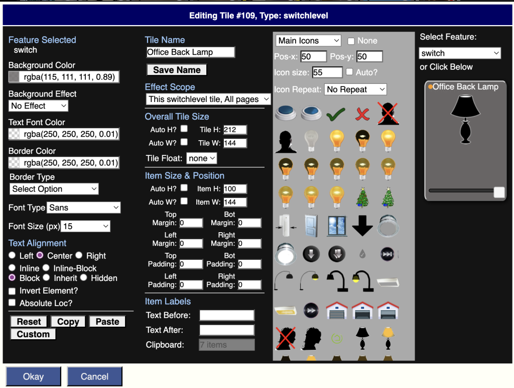
Most of the features in the Tile Editor are self-explanatory such as the color and size controls. Edits are made by clicking on the fields you want to change in the tile shown in the upper right corner, or by selecting the field from the drop down list in the top right corner.
Custom Name
The Custom Name and Effect Scope perhaps require explanation. A custom name can be assigned to the tile. Any text can be specified in the top central box, and then the “Save Name” button must be pressed.
Effect Scope
The Effect Scope determines whether changes made in the Tile Editor apply to just this tile on all pages (default), just this tile on this page, all tiles like this on all pages, all tiles like this on this page, all tiles everywhere, or all tiles on this page. Edits made after making this selection will have the selected scope. This means you should select the desired scope first and then make edits.
Field Selection
To style a particular item, first click on it in the tile display or you can select the item from the drop down list below the tile. Some items are hidden and can only be selected from the drop down list. For those items you can select them, un-hide them, and style them however you like.
The first option in the list is called “whole tile” and is used to style the background or border of the entire tile. So if you want an image background on a tile, select “whole tile” and then pick the image you want. Images can also be assigned to individual fields on the tile. When whole tile is selected you can also edit the border and shape of the entire tile. For example, this can be used to make oval or circular tiles, or to put a shadow around your tile.
Some fields have multiple states. For example, switches have on and off states and contacts have open and close states. Presence sensors have present an absent states. Some tiles have more than two states such as thermostats and home modes. Each click rotates to the next state. The active state will be shown in the upper left corner underneath “Feature Selected”. Each state for each field can have its own icon, color scheme, font, size, and spacing. The “all” state is selected when only the state name is shown under Feature Selected. Any styling applied to the “all” state will be used as the default style for every other state of that same field until it is overridden by styling a specific state. This is provided so that users can style the “all” state first to ensure each state has the same size, color, and spacing and then a custom icon, font, or color can be specified for a given on/off or open/close state.
Icons
Icons are selected from one of five default locations: Main Icons, Main Media, User Icons, User Media, or User Photos. The first two locations contain HousePanel provided default icons and media. The User Icons, User Media, and User Photos are empty folders by default but users can upload their own icons or graphs files to these folders. Uploads in png, jpg, and gif formats are supported. To upload content, select one of the User locations and then select the Upload button. Once you have content in these folders, icons or media can be selected from them just like the other folders. Icons can also be picked from the provided library of standard monochrome icons that are similar to icons found on Android devices. Icons can be assigned to any state of any field. Once an icon is selected, it can be resized and realigned using the controls shown beneath the storage type dropdown box. If you want to clear an icon select the None checkbox.
Colors and Fonts
Entire tiles or specific fields can also be set to any color you like. The boxes on the left are used to set the background and foreground colors. The Background Effect box is used to add a gradient to the background color to add some flair to your tiles. If you want the text of an item to not show, pick any color and set the transparency to a very small number, such as 0.01. Hiding will also work, but hiding will also hide any icon assigned, so if you want the icon to show but not the text, use the transparency trick. The font type and size boxes do what one expects they do. One nuance is the font size is in pixels, not font points.
Text Alignment
Text alignment is achieved by using one of the radio buttons under Text Alignment. If you select Left, you can also nudge the item to the down or right by selecting a non-zero value for Top Padding or Left Padding. If you want a specific location, you can also click “Absolute Loc” and then change the Top Padding and Left Padding values to your liking. When in absolute mode padding is actually interpreted as the absolute location of the item. Normally fields are stacked on top of each other in the order they appear. You can specify the display type for a given field. The default type is “block” which places the field on its own row in a tile. Selecting “inline-block” will group the field with the next field but only if that field is also displayed as “inline-block”. The “inline” display type will force the field to display side by side with the next field. When you do this you may want to also add some Left Padding to the next field. Finally, a field can be hidden completely by selecting the hidden display type. This should not be done on specific field states although nothing prevents a user from doing so. The appropriate way to hide a field is to select its baseline state (ie, the “all” state) and then pick the hidden radio button.
Border Color and Border Type
Border Color and Border Type selections are applied every time a selection is made in the drop down box. For example, if you want an item to have a round, thick border, you would first select “Circle”, then “Thick”. The order matters – the shape should be selected first, then the line thickness, and then the color. The “Shadow Square” and “Simple Square” options are primarily useful for styling the whole tile by first selecting Whole Tile as the field.
Overall Tile Size
These settings apply to the entire tile. If Auto H or Auto W are selected, the tile will take on the size required to fit all items within its boundaries, subject to the padding settings in the section below it. The Tile Float option is used to float the tile to the left or to the right of the screen. This is useful when the tile is taller than the other tiles and you want the row to ignore the height of the floated tile.
Item Size & Position
This section is used to change the size and position of whatever is selected. Margins and padding can be set. Margins will affect the spacing on the outside of the virtual box, while padding will add space on the inside of the virtual box. The sum of padding and margin will add up to the amount of space between the adjacent item and this item.
Item Labels
This section is used to set text to be added to the tile before or after the existing device name and state. This is typically used to identify a field and to specific units. For example, in a weather tile the humidity field would have the Text Before label set to “Humidity: ” and the Text After label set to “%”. This would make the item display as: Humidity: 68%. Notice the : is followed by a space in the Text Before setting.
Format Copy, Paste, and Reset
To copy the formatting of one tile to the formatting of another tile, select the Copy button, close the editor window, then open the editor for the destination tile, then click “Paste”. All of the appropriate attributes will be copied to this tile. If there is an attribute that doesn’t make sense for this tile, it will simply be ignored. To reset the formatting of a tile, first select “Whole Tile” as the field then click the Reset button. You can also reset the formatting of a specific field by selecting that field from the dropdown list before clicking the Reset button. If you styled specific field states, you will need to reset those states too, or you can reset the entire tile.
Custom CSS
The Custom button enables users to specify any valid CSS styling to the selected field and state. Custom CSS is specified in the following input box:
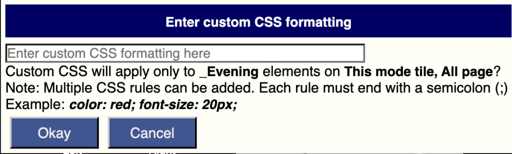
The Tile Editor writes a custom CSS file called “customtiles.css” to achieve the requested styling. This file is saved in the “user[x]/default” folder, where [x] is the user number. For most people their user number is 1 so the file will stored in “user1/default/customtiles.css”. If you have multiple users, each user will have their own folder, so customizations are user specific. Normally this file should not be edited directly, but if you do want to make your own custom CSS edits, this is the best place to store them. You can also customize your setup by editing the “skin-housepanel/housepanel.css” file. The “tileeditor.css” file has styling for the HousePanel app itself and should never be edited, but the true power user is welcome to edit this file to customize how their own HousePanel app looks.
Any change made to skin-housepanel/housepanel.css or tileeditor.css impacts ALL users so only do this if you want the changes to be seen by everyone. Finally, there are other skin folders that were used in prior versions of HousePanel. You can provide your own set of icons and styling in those folders and then rename them to skin-housepanel to achieve a completely different look.