There are three ways to customize HousePanel
- Tile Editor
- Tile Customizer
- Manual CSS Editing
The Tile Editor is used to change how tiles and pages look, including background images, icons, colors, fonts, and alignment. The Tile Customizer changes the actual content of each tile. Tile Customizer can be used to add user text and images to a tile, add clickable hyperlinks, and even add fields from one tile into another. Tile Customizer is also where users can define powerful rules to control their smart home based automatically. The next section describes how to use this powerful feature. Finally, all styling in HousePanel is done using industry standard CSS settings, so maximum flexibility can be obtained by manually editing certain files.
Tile Editor
To use the editor, select “Edit” mode by clicking on the “E” in the upper right corner, or you can hit the “E” key on the keyboard. While editing is possible on a tablet or phone, it will be a frustrating experience so editing on a PC or Mac computer is strongly encouraged. Once you are in edit mode, each tile will then show a gear icon and a blue dot in the upper left corner, a red dot in the upper right corner, and a resize arrow in the bottom right corner upon hover. Clicking on the gear icon will open the Tile Editor shown below. The red dot will delete the tile. The blue circle will open the Tile Customizer described in the next section. The resize arrow can be used to dynamically resize the tile.
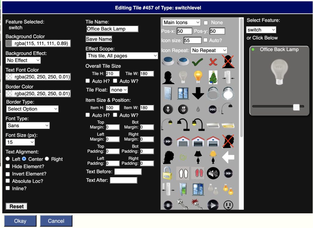
The Tile Editor window can be dragged around on the screen so that you can see the effects of edits made on the main screen immediately. The Tile Editor is mostly self-explanatory as it uses standard dialog box features. Edits are made by clicking on the fields you want to change in the tile shown in the upper right corner, or by selecting the field from the drop down list in the bottom right corner. When you click on some fields they will cycle through multiple states. This allows you to assign different icons and styling to different states of a device.
Custom Name and Effect Scope
The Custom Name and Effect Scope perhaps require explanation. A custom name can be assigned to the tile. Any text can be specified in the top central box, and then the “Save Name” button must be pressed. The Effect Scope determines whether changes made in the Tile Editor apply to just this tile on all pages (default), just this tile on this page, all tiles like this on all pages, all tiles like this on this page, all tiles everywhere, or all tiles on this page. Edits made after making this selection will have the selected scope. This means you should select the desired scope first and then make edits.
Field Selection
To style a particular item, first click on it in the tile display or you can select the item from the drop down list below the tile. Some items are hidden and can only be selected from the drop down list. For those items you can select them, un-hide them, and style them however you like.
The first option in the list is called “whole tile” and is used to style the background or border of the entire tile. So if you want an image background on a tile, select “whole tile” and then pick the image you want. Images can also be assigned to individual fields on the tile. When whole tile is selected you can also edit the border and shape of the entire tile. For example, this can be used to make oval or circular tiles, or to put a shadow around your tile.
Some fields have multiple states such as “on” and “off”. Some tiles have multiple states such as thermostats. Each click rotates to the next state. When the state has no modifier after it, that means the styling will be the default for all other states. Sometimes you have to set the height of this item for it to show up and then you can set the icon or font styling to whatever you want. Subsequent clicks will cycle through the available states of the tile allowing you to set the styling for each state independently. IThe way CSS works is more specific styling always takes precedence so if you style a specific field state, that style will still be used even if you set a style for all field states.
Icons
Icons can be selected from your Local Storage or it can be taken from a library of standard Android icons. The Local Storage option will list all icons in the “icon” folder of the active skin. There is also a directory called “media” in each skin:-:s folder. This is where you can load any custom image you want to show. In the default “skin-housepanel” skin this folder contains a number of interesting backgrounds you can use. This is how I used my photo in the presence tile. Once an icon is selected, it can be aligned to the left, center, or right side of the tile using the radio buttons just beneath the storage type dropdown box. If you want to clear an icon select the None checkbox.
Colors and Fonts
Entire tiles or specific fields can also be set to any color you like. The boxes on the left are used to set the background and foreground colors. The Background Effect box is used to add a gradient to the background color to add some flair to your tiles. If you want the text of an item to not show, pick any color and set the transparency to a very small number, such as 0.01. Hiding will also work, but hiding will also hide any icon assigned, so if you want the icon to show but not the text, use the transparency trick. The font type and size boxes do what one expects they do. One nuance is the font size is in pixels, not font points.
Text Alignment
Text alignment is achieved by using one of the radio buttons under Text Alignment. If you select Left, you can also nudge the item to the down or right by selecting a non-zero value for Top Padding or Left Padding. If you want a specific location, you can also click “Absolute Loc” and then change the Top Padding and Left Padding values to your liking. When in absolute mode padding is actually interpreted as the absolute location of the item. Normally fields are stacked on top of each other in the order they appear. You can force a field to display side by side with the next field by selecting the “Inline” checkbox. When you do this you may want to also add some Left Padding to the next field.
Border Color and Border Type
Border Color and Border Type selections are applied every time a selection is made in the drop down box. For example, if you want an item to have a round, thick border, you would first select “Circle”, then “Thick”. The order matters – the shape should be selected first, then the line thickness, and then the color. The “Default”, “Shadow Square” and “Action Tiles Look” options are intended for use only when Whole Tile is selected. These options will make the entire tile look one of three specific ways.
Overall Tile Size
These settings apply to the entire tile. If Auto H or Auto W are selected, the tile will take on the size required to fit all items within its boundaries, subject to the padding settings in the section below it. The Tile Float option is used to float the tile to the left or to the right of the screen. This is useful when the tile is taller than the other tiles and you want the row to ignore the height of the floated tile.
Item Size & Position
This section is used to change the size and position of whatever is selected. Margins and padding can be set. Margins will affect the spacing on the outside of the virtual box, while padding will add space on the inside of the virtual box. The sum of padding and margin will add up to the amount of space between the adjacent item and this item.
Item Labels
This section is used to set text to be added to the tile before or after the existing device name and state. This is typically used to identify a field and to specific units. For example, a typical use would be to set this for a speed value 9f 68 by setting Text Before to “Speed: ” and Text After to ” (mph)”. This would make the item display as “Speed: 68 (mph)”.
Copy and Paste
This feature is useful for copying the formatting of one tile to the formatting of another tile. To copy and apply the formatting of the entire tile, first select “whole tile” in the upper right corner, and then click “Copy”. If you only want to copy the attributes of a specific item, pick that item in the upper right corner or click on the item on the visual icon display, and then select “Copy”. You will be shown a list of attributes copied to the clipboard. To use the clipboard, close out the editor for this tile, and open the editor for the destination tile, then click “Paste”. All of the appropriate attributes will be copied to this tile. If there is an attribute that doesn’t make sense for this tile, it will simply be ignored.
CSS Editing
If you are more of a power user and want to fully control your own destiny, you can write your own custom CSS, but using the Tile Editor is much easier. It is worth noting that the Tile Editor writes CSS to achieve the requested style and stores them in a file named “customtiles.css” in the user’s default folder. For most people this will be “user1” but if you have multiple users, each user will have their own folder, so customizations can be user specific. This file normally should not be edited directly, but if you do want to make your own custom CSS edits, this is the best place to store them. You can also customize your setup by editing the housepanel.css file. HousePanel applies the CSS in housepanel.css first and then those in customtiles.css, so edits made in customtiles.css will override any made in housepanel.css. Any change made to housepanel.css impacts ALL users so only do this if you want the changes to be seen by everyone.
Tile Customizer
No other Dashboard has a feature as cool as this, so I encourage you to spend time here understanding how this works so you can make full use of it’s amazing features to create the dashboard of your dreams. In short, this feature gives you the flexibility to define new fields on any tile using content from any other tile or external resource. Keep reading to learn more!
The Tile Customizer alters tile content by adding fields from other tiles or external sources. The Tile Customizer is a powerful tool for making custom panels. All fields added by the customizer are subsequently available to the Tile Editor so they can be styled. By default, RULE fields are hidden so they will need to be unhidden using the Tile Editor if you want to invoke the rules manually or show them for some reason. They are hidden by default because RULE’s run on their own without user intervention.
To use the customizer, go into “Edit” mode by pressing the “E” key or clicking on the round “E” icon in the upper right corner. Next click on the blue dot with a number inside of it. This will open the Tile Customizer for the tile selected and associated with the number inside the blue dot. The Tile Customizer screen looks as follows:
The Custom Type option in the upper left is used to pick what type of customization you are performing. Seven options are available: TEXT, POST, GET, URL, LINK, LIST, and RULE.
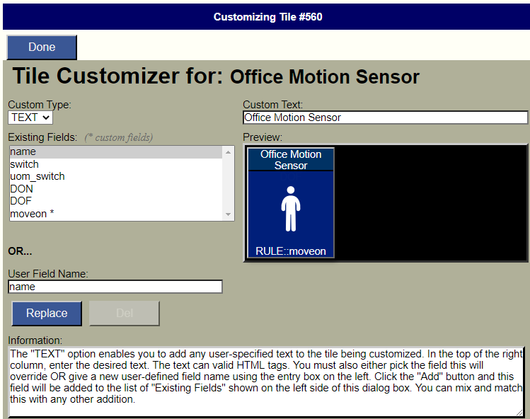
TEXT Types
TEXT custom fields are typically used to add user-defined text to a tile. However, there are some special text fields that do special things, including password control, allon tags and read-only flags. All variants are described in the following sub-sections.
Plain Text
Plain TEXT links are used to add any user provided text to the tile. When adding anything to the tile, you must name the field in the User Field Name area on the left. You can also select an existing field, in which case your text will show up instead of the default behavior that this tile normally shows. Be careful with this feature because it can remove important functionality. Then again, this flexibility means you can make all sorts of creative effects. For example, you can use this to intentionally disable a particular command by replacing it with static user-defined text.
Passwords
TEXT custom fields can be used to add a password to any tile. To do this create a new TEXT field named password, all lowercase. Then enter the password in the text box in the upper right. Click “Add” and the password will be converted to a hash. This hash is the value stored in the TEXT field. When this custom field is present and the tile is clicked, the password must be given for the action to be performed.
allon and alloff
If a field is created with the name “allon” or “alloff” then clicking on the field will cause all switches on the page to turn on or off. Be careful using this because anything with a field named “switch” will be turned on, including audio tiles.
readonly
If a field is given with the name “readonly” (all lowercase) then the entire tile will be treated as a display-only tile, and any attempt to click on an otherwise actionable field will instead display the tile status. The value can be set to anything but something logical like “true” is recommended.
POST and GET
POST and GET types are used to add a user-specified web service to the tile being customized using the method selected. In the top of the right column, enter a valid URL to the web service. You must also either pick the field this will override OR give a new user-defined field name using the entry box on the left. Click the “Add” button and this field will be added to the list of “Existing Fields” shown on the left side of this dialog box. I haven’t personally found too many uses for this feature other than using it to invoke commands in EventGhost or Maker API. The return from the POST or GET call will be ignored.
URL
URL custom fields will open the specified URL in a separate window when the field is clicked. The text entered must begin with http for this to work. I’ve used this to open Spotify or Google search web pages directly from my dashboard, but it can be used to open basically any URL.
LINK
LINK types enable you to add any other field from any other tile in your smart home to the tile being customized. This will be a virtual link in that the state will stay in sync with the original. The customize page will look different in this mode:
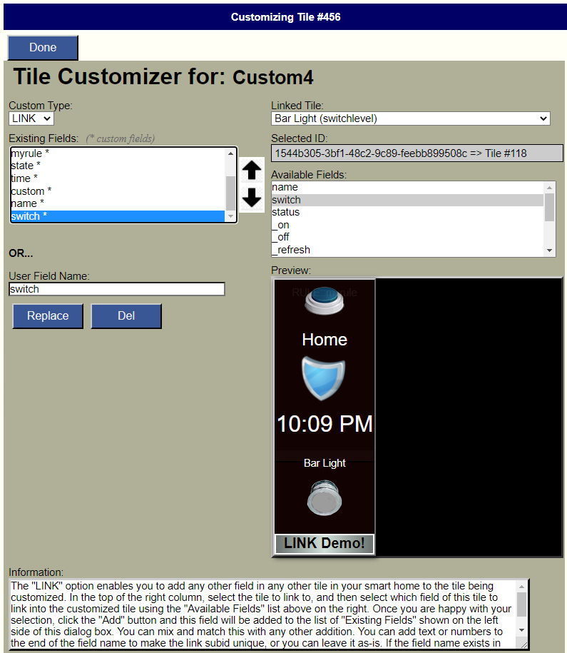
In the top of the right column, select the tile to link to, and then select which field of this tile to link into the customized tile using the “Available Fields” list above on the right. Once you are happy with your selection, click the “Add” button and this field will be added to the list of “Existing Fields” shown on the left side of this dialog box. You can mix and match this with any other addition. In the above example I added a light switch to a temperature tile, followed by two user text fields.
Note that with LINK customizations the field name must be taken from the linked tile. If you link in a switch field from anothueer tile, it will replace the existing switch field. If you attempt to link in another switch field, it will overwrite any existing one unless you alter the field name by adding some custom text after the word switch. For example, you could make this field name switchtwo. This only works if there is already a linked field named switch.
LIST
List custom fields are used to create a list and associate graph of historical values of any field on any time in your system. For example, you can use this to show a graph of the dimmer setting of a particular light. A particularly useful application of this feature is to show the history of a variable value. Imagine you have a variable to keep track of a particular fact or state. Every time you change that variable a new value will be pushed to HousePanel so the LIST feature could be used to capture that new value in a table and display a graph of historical values over time. Every time you specify a LIST custom field, you can also specify how often the field will be reset. You can pick hourly, daily, weekly, monthy, yearly, upon mode changes, or never. A field will be created for this list. When you click on that field name, the historical graph and table will be displayed, along with an option to reset the list.
RULE
Rule custom fields are used to involke the built-in rule engine in HousePanel. This built-in feature is a nice complement to the highly flexible rule engine built into the Hubitat hub. It is provided mainly for users to implement rules that trigger on one hub and invoke an action on a different hub. For exanple, I use it to trigger an ISY integrated switch based on the state of a Hubitat door sensor in my smart home. There is no other way to do this logic other than using the rule engine built into HousePanel. Full instructions and examples for HousePanel’s RULE engine are given in the section dedicated to RULEs.